I used Adobe Illustrator CC for designing my own logo. The logo will be used on my website and my products of the major project.
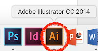 |
| Adobe Illustrator CC |
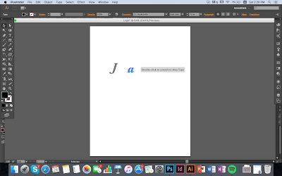
My general idea came from the first two letters of my name, Janis. People usually use the first letters of their name, I do not want to be so mainstream, so I choose "J" and "a". I started to think about what can I do with these two letters.
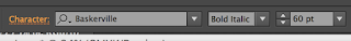 |
| The font I picked. |
Now, I am going to show the process I design and improve my logo:
 |
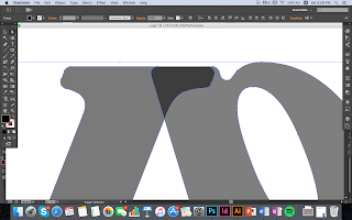
| Firstly, I tried few different position for the letter "a", such as put it upside down. |
 |
| I reversed the letter "a" and a small part of it overlapped on "J". |
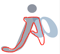
As I want to make the angles smooth, I had to create the outline of the font so I can adjust the outline.
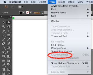 |
| Click "Type", then select "Create outline". |
 |
| You can see there are some dots on the edge. |
 |
| I adjusted it to be smooth and round. |
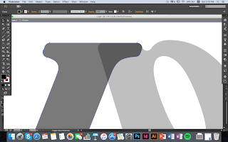
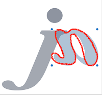
However, it created an outline of two letters, I wanted to adjust the position of the letter "J" only. Then, I found out I can double click on "J". The unselected object would be lighter in colour, so I can be more concentrated on the letter "J".
 |
| after adjustment. |
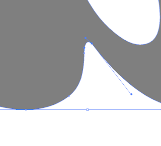 |
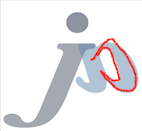
| I adjust some small details by moving the dots with a line. Double click the dots, it will show a line with two dots on two ends. |
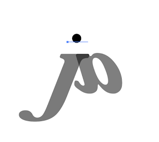 |
| Then, I added a circle. |
 |
| The final design before changing colours. |
I have spent more than 2 hours on designing and adjusting the logo. I think the main reason I spent so much time on it is I had to do many tests to see what angle and size look better. Then, I put different colour to see which one is the best for the logo.
The reason I did not choose this one is it is the green colour does not fit with the blue-black colour. Overall it looks so dull and not attractive.
Afterwards, I choose the blue colour tone, so they must match with each other. However, this time it is too dark in colour, it looks boring.
 |
| The final piece |
Lastly, I used blue-grey for "J" and light blue for "a". It looks young and energetic. It is not the perfect logo for me, so I might improve it in the future.
 |
| I put it on the top of my website. |
Now I am going to explain my design. It might be only two letters "j" and "a" in my design, actually you can see my name Janis in these two letters.
 |
| "j" |
 |
| "A" |
 |
| "n" |
 |
| "i" |
 |
| "s" in calligraphy alphabet |
I have watched a video called "[ AI ] adobe illustrator毛筆手寫字製作大法" on Youtube 2 months ago as I wanted to design a logo for my friend. The Youtuber speaks in Cantonese, so it might not be available to everyone, but it is quite useful for starters. You do not have to listen to him at all, you can look at what he did in first few minutes. I think the most useful and helpful part is the first few minutes.
After all, I am so happy that I have my own logo now. However, I might want to draw it with digital drawing tablet later and modify the colour. At this moment, I like this logo and I would like to use it for my products of the major project and my website. It is the second time for me to use Adobe Illustrator, and I only know some basic skills of it. I have to do more practices and explore further more in the coming days.


No comments:
Post a Comment