As I am going to design a series of accessories for visually impaired, I would like to find the inspiration from the current products.
This post is going to mark down the current products I find are interesting and useful for my project.
 |
| [1] |
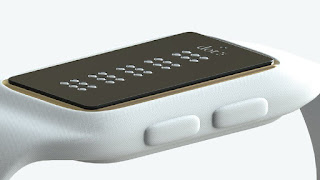
1. Smartwatch
It is a smartwatch designed by a Korean firm for people who cannot see. There is a display made up by a series of dots where the users can feel the rising and falling dots spell out words in Braille. Besides the use of telling time, it can also be used for reading books and long message, and directions as it can be connected to maps.
There are some feedbacks from a user who love gadgets and is visually impaired. She said
It is hard to read anything longer than a text on the Dots. Nonetheless, she thinks that the users, who are visually impaired, will struggle to use the watch for directions. They would use a dog or a cane which takes up one hand already, however, it has to be two free hands for holding the watch in place and touching the Dots.
I find it is useful for my project as checking time is something we do every day, if I can design a watch for visually impaired people, then they can check the time easily on their own. In addition, the design of a smart watch is vital to the users, such as texture and
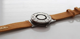
The following smartwatch is designed by Hyungsoo Kim in 2013.
 |
| [3] |
Side ball bearing indicates the hour and front ball bearing indicates minutes. Users can check the time by touching the balls and the marks. The major marks are even designed a bit differently to distinguish with minor marks.
I appreciate the simple design which makes it easy to clean, as they have to touch it for checking time, so it might get dirty easily. However, I think it is better to check the time by touching braille display. With Braille display, visually impaired people can know the time directly.
Source:


