 |
| Idea 1 |
This is our first idea- Taking a picture with an advertising light box in a bus stop. The advertisement on the lightbox is about Dulux. Our model, Jaewan Kim, will hold a painter and a Dulux paint box standing next to it. The advertisement is actually painted by him, which represent Dulux paint is user-friendly, easy to paint. However, the message is not obvious enough, readers might not understand our meaning.
 |
| idea 2 |
Then, we have searched some Dulux advertisements, and find out its themes including eco-friendly, natural colour and less harm to human. We picked "less harm" as our main theme. In order to show our message, we would like to take a picture of Kim is sleeping in his room, which is still not yet finished painting. It means even the painting is not yet done, customers still can stay inside the room. Nevertheless, we think this is too mainstream and we want to do something showing our own style.
 |
| idea 3 |
Finally, we decided to find a grassland picture as a background and our model Kim will be holding a painter like he is painting something. The reason we pick grassland is it represents environmentally friendly, which is something we want the readers can associate with Dulux in thinking. Besides that, we will use Photoshop to edit the picture like Kim is painting the grass on the ground, to show the 'grassland' is actually painted by him. It brings out the message of Dulux paint colour is very natural, which is very close to the actual colour. Also, Dulux paint is user-friendly, customers can pick up easily.
The following pictures are showing the process of creating our advertisement.
 |
| Cameraperson: Janis Chan (left) Model: Jaewan Kim (right) |
 |
| One of the pictures I took |
 |
| Grassland - The picture we found on the internet |
I was trying to find the best angle to take the picture which can perfectly match with the picture we found on the internet.
Furthermore, we use Photoshop to cut and paste the Dulux paint box and our model into the picture. white brush is used in the picture, we blur the outline so as to make it look more natural.
 |
| The final product |
Finally, we put a Dulux logo and its link on the left top of the picture in order not to catch too much attention of the readers from our main theme. A slogan is put onto the right bottom, and the size of the words is bigger so it can clearly explain our message.
The following advertisements of Dulux are found in Google search:
 |
| [1] |
 |
| [2] |
 |
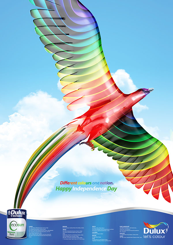
| [3] |
 |
| [4] |
Comparing to the above advertisements, there are few parts we are the same, or similar with. For the structure of an advertisement, we also put the logos and the picture of Dulux box on the corner. Besides the structures are similar, they usually tell readers the message with a text written in the middle. The main character is always placed in the centre, which can easily catch the eye contact. One slightly different part is- our advertisement is monotonous, mainly green colour. In the contrast, Dulux advertisements are usually more colourful.


No comments:
Post a Comment