Saturday, 26 November 2016

Updates on My Website

Regarding the comments I have received from my teachers and classmates, I have two major things I have to improve on my website. You can know more by reading the previous posts "Feedback on Presentation about Website / Blog / Major Projects" and "My Reflection Based on the Comments I Received". I am going to modify my website based on the feedback and reflection written in these two posts.

First of all, I am going to change the background pictures to the sketching and drawing related to my progression route, product design. Before I post the new picture, I edited it in advance.


The original picture
I used the function provided in Wix

I changed the position.
As the size of the picture does not fit the layout very well, I have to pick the position of the picture in the image setting. Then, I do the same to another one. This time I changed it from "scale to fill" to "tile", so it would show the whole picture, and fill the background with repetition.

I changed it to "Tile".

After edition (Left) Before edition (Right)

 You can see the difference between before and after edition from the above picture. I have changed the brightness, warmth, and contrast. Therefore, they look more sharp and eye-catching.

Apart from the background picture, I have to change the text size too. Actually, it is not that small on my laptop screen, however, it is so hard to see the words when it is shown on the computer screen inside the campus.

It looks like this now.

However, I found that lowering down the opacity looks better and I had a little change on my second background picture.

The second background picture is not good enough, and it did not fit with the rest. Therefore, I want to make a repetition of this picture by Photoshop. I am going to show the process of it now:

I put two same pictures together in Photoshop and save it as a JPEG format.

As I am using MacBook Pro, I can use the tools provided.

Select the area I want and crop it out.

Then I use the edit function in Wix.
Afterward, I changed the opacity and the position.

For the opacity, I think the original one is too sharp, the colour attracts all the attention from the text (Janis Chan, Product Design Student). After lowering down the opacity, it looks better.

After that, I was looking at the design of the layout on the left-hand side. I had tried some different shapes with different opacity levels. I was thinking which shape should I use, Shape 1 or Shape 2.

Shape 1

Shape 2

Finally, I changed the opacity to 85% and picked Shape 2 because it matches with all background pictures. Then I have changed some little details.

Before

After

I am going to show you the rest of it.


I have spent a day on editing my website, I did not expect that I would spend so many time on it. I am going to post my process of designing my own logo very soon. Hopefully, I would post my final design of key cover in few hours too.

Monday, 21 November 2016

Key Covers (1)

I am now designing key covers, I will post all the process in this post. To begin with key drawing, I found a picture on the Internet, as I am not familiar to draw on a digital drawing tablet, it would be better for me to draw a key based on the real object picture.

Source: Key
The picture I found on the Internet
 Then I created three layers: "Layer 1", "Key pic" and "background". I duplicate the key picture from another file to here and rotate the image to vertical.

Next, I am drawing the outline of the key on Layer 1.


As you can see, I am drawing the outline.
I found it is very difficult to draw a straight line, especially I seldom use a digital tablet.


After drawing the outline, I am going to paint it. I paint the background colour first. Then I started to work with the shadow. In order to make it looks more natural, I change the opacity. Higher opacity, darker is it.


I started adding shadow.
Finished drawing the key.
Although it looks simple, it took me more than 3 hours to get it finished. Now I am going to save this as a picture, so I will be designing the key cover with this key drawing.

A Short Post about How do I Practice Using Drawing Tablet

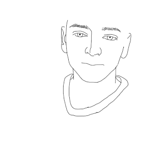
Recently, I am trying to use the Photoshop tools to paint a human face. I found out that I can use eyedropper tool to find the exact colour of the original picture. So I mainly use eyedropper tool and brush to paint my friend's face.


Eyedropper Tool
Brush Tool
First of all, I use several layers and put the original picture at the bottom. I draw the outline of his face first.

Then, I start to use eyedropper tool to get the original colour and paint it in another layer. When I get the colour from the original picture, I will draw the outline of a colour zone, then I will hide the layer of the original picture, then fill in the colour zone. Sometimes, I have to zoom in so as to paint the details.

After doing the same steps repeatedly, you can see his face are painted in many small different colour zones.

It shows the layer of my painting and the original picture.

Sometimes I have to look at the original picture, as it is so hard to paint above it.
The most difficult part is his hair. It is hard to paint above the original picture, so I have to paint it first, and do the details by looking at the original picture.


Sometimes it doesn't really look good when you zoom in and look at the specific part of it.

However, it looks much better when you zoom out till its original size.


Although it hasn't finished, I found this skill is quite useful for my major project as I can paint my products based on the real object to make my drawing realistic. I continue the painting when I want to take a break from doing homework, I have spent approximately 10 hours on it in total. Now I am working with my final piece of Major project, I will be updating my process today.


Thursday, 17 November 2016

Practice How To Use Digital Drawing Tablet

This summer I bought a Wacom Intuos Pro Medium Digital Drawing Tablet in Hong Kong. However, I do not know how to use it. Now I am going to practice and explore more about in on Photoshop.

In the beginning, I had no idea how to draw something with Photoshop. Then my friend showed me that it can be changed to "Painting" mode on the right top button.

Then there are lots of different brushes shown in the right column. 


On the right top
As there is an option for you to choose whether you want to use the function of "pressure sensitivity". It is a function to change the darkness and thickness of the lines by pressing harder or gently. 
You can find the button on the left of the bar on the top.


You can see the difference between on or off the function on the right-hand side.

The upper one, which is without the function, has a darker colour and in one darkness, vice versa.

Since I do not need the function yet, I turned it off. Then I created a new layer for key and one for key cover.


Key
After drawing a key, I draw the key cover in another layer and put on some grey colour with the "pressure sensitivity" function.
Key with the key cover
Although I still have not get used to drawing on a tablet, I found it is easier than I expected. I thought it would be so hard to use the drawing tablet, but I believe that I can get up after practice more. There are lots of different functions I have to explore. I will keep posting my process and practice here.

Key Covers Design Development

Key covers from Google Search
Usually, Key covers are designed for a certain size of keys. Therefore, I want to design a key cover which can fit to a range of key sizes.


I have to know the width and length of different size of keys first, so I asked some of my classmates to compare their keys.


My classmate's and my keys
As you can see there are different shapes, sizes of keys.

I made a note of what I have found from these keys and I am going to explain more about it.

My note


I found out that there are two main differences from the top of keys:


1. Different shapes
They have several shapes like circle, square, and hexagon.


2. Different sizes and positions of the hole
Some of them place the hole in the middle of the top, some of them place it in top right hand side.
I may design a hole on the top of key cover, since the hole on the key is placed in different position.


As I have mentioned, I would like to design a key cover which can fit into a range of key sizes. Therefore, I measure the sizes of those keys. Then, I found that the width of the top of key are usually about 2-2.5cm and the length of that is approximately 1.5-2.5cm. For the width of the middle of the key is about 1 cm.


So now I have to think about how to design a key cover which can fit to this range of key sizes.

Wednesday, 16 November 2016

My Reflection Based on the Comments I Received

After receiving the feedback from my classmates and teachers, there are several things I have to improve:

For the website,
1.Write more details about myself and post something about my major project
I am going to improve my biography by adding more details about myself and the reasons I would like to be a product designer. Meanwhile, I should speed up, so I can post some pictures about my major project on my website.
2. Add a title for Home Page and change the text size
As the text size of "product design student" is a bit small, change it bigger would be better. I am thinking to change the font too, in order to make the website look better. Also, my teacher said I should add a title to my website, so the visitors know my identity and progression route easily.


For my major project,
1. Try to do research about existing products as much as I can
Although I did some research about visually impairment and some existing products, I better do even more, in order to find more inspiration to make my design better.
2. Think about presentation of my products
My teacher suggested me to think about my target market, they may not be visually impaired people only, perhaps it can be someone buy them as a gift or non-disabled people can use them too. Besides that, I should think about whether they are going to be sold as a series or separately. It is a good question I have to think about, as I did not think about the packaging of my products and how am I going to sell them. I will make a decision as soon as possible, and I will update my process and idea development on my blog.
3. Manage my time properly
As I am still in the stage of drawing graphs, I better catch up the speed and go to the next stage. I am going to finish my graphs and post them on my blog in 2 days. Then, I would go to Leicester market search for materials today. Time is running short, I better get my final pieces done as soon as possible.


For my blog,
1. Change the background
I should change the background to something related to product design, such as sketching of products.
2. Put more pictures about major project
It would be better to add more pictures to show my working process, as it would be more interesting and easier to understand.

Monday, 14 November 2016

Feedback on Presentation about Website / Blog / Major Projects

Today we are going to do a presentation about our websites, blogs and major projects. We have to give each other some critical feedbacks. I will write down the feedback received from my classmates and teachers, also, the comments I would like to give my classmates.


1. Myself
Website:
- Simple and organised / User-friendly
- Quality of Home Page background picture is not good
- Add Title & text should be bigger in the Home Page
- Should be more related to my progression route
- Should write more about myself
- Should post more major project
- Good customization and idea (try to make the blog more interesting)

Major Project:
- Clear and detail plan
- Should be hurry up
- Progression route is clear
- Idea is impressive
- Try to do research about visually impairment as many as I can (specifically existing products)
- Think about presentation (a set/collection? or sold separately? Maybe not only for visually impaired people?)


Blog:
- Background should be something related to my progression route
- Clear reflection and planning
- Interesting / meaningful theme
- Clean and organisation
- Show efforts to learn the software
- Well-developed
- Should put more pictures about major project

Presentation:
- Effects and gallery are good

- Talk more about the blog and major project


2. Dowhee
Website:
- Home Page background is lively
- Own logo
- Biography is interesting (she draws herself)
- Better to put her own picture too!

Major Project:
- Apply her research into her major project
- Showing every process
- How does it related to digital arts

Blog:
- Many posts
- Many research and references about books (layout and book form)
- Great to see the idea development
- Practice of using software
- Try to make one in real life after doing research
- Do more reflections (based on what you have done, e.g. research/ practise/ working)

Presentation:
- Can speak louder
- Slower down the speed (sometimes it is too fast to move to next post/ cannot see the picture)

P.S. Click this to her blog.


3. Augustyna Janczak
Website:
- Style
- User-friendly
- Simple and clear
- I like the colour and text font of the website

Major Project:
- Have to be hurry up (changed the plan)
- Good to show her inspiration

Blog:
- I like the background, it shows her progression route
- I would like to know more her other posts besides major project
- Do more research related to her major project
- Better to do more reflection (e.g. why would you change your idea)
- Show more process on her major project (e.g. Idea development/ process/ reflection)

Presentation:
- Loud enough
- Can be more confident


4. Khaled

Website:
/

 Major Project:
- I can see he has spent lots of time and efforts on it
- Lots of pictures
- Show his process


 Blog:
- Background shows his progression route (I like it)
- Lots of research
- Lots of drawing but how can it related to digital arts
- I would like to know more about his reflections on his works

Presentation:
- Speak louder


5. Kate
Website:
- Should change the text colour (Especially "interior Designer")
- I would like to know her biography and contact page

Major Project:
- Better to show more process of designing the room
- Can see she put lots of efforts in it

Blog:
- Many practices (show her efforts)
- Lots of research
- Lots of reflections


6. Santiago
Website:
- the text is a bit hard to read
- the size of text in biography is a bit small
- I like the style of gallery
- It is convenient to see his blog on his website
- Better to add the social contacts (e.g. Blog and Google+)

Major Project:
- It is good that he has many pictures to show his process

Blog:
- Should do more reflections (e.g. based on his research and his working process)
- Better to write more description, so it would be easier to understand


7. Sujin
Website:
- the background is eye-catching and stylish
- The text colour beside the one in Home Page ("SUJIN", "home", "work" etc) should change colour (Background is pink-purple and the text is pink)
-

Major Project:
- Detail planning
- Process seems going quite good

Blog:
- I like the background of blog
- Lots of research/reference
- Better to write more description, so it would be easier to understand
- Should do further reflection
- It is good to show your plan by words and mind-map
- Show your effort on your major project by doing Photoshop practice
- It is good they you show every process with lots of pictures (clear)


8. Naythun
Website:
- Should improve the Biography
- Add a background (besides Home Page)
- Simple and user-friendly

Major Project:
- The meaning behind the major project is really good
- A clear and detail plan
- Put efforts on it (each piece of work spent 3 day to get done)

Blog:
- Lots of research (even do a study on a research)
- Good to show every process with lots of pictures

Final Show: In-class Activity (Watercolour)

I told Tom about the idea I have been explaining in last post, he encouraged me to present it to the whole team. They like my idea, and we ...