Sunday, 27 November 2016

Key covers (3)

Since there is a problem of my digital drawing tablet and the pen, I could not draw normal lines. However, it was fine with my laptop. It took some time to trying to fix it. Even now, I still cannot find the problem. Yet I have changed the setting of the pen, so I can continue my work now.

As the hole on the top was too small for visually impaired people, I changed it to another one. Customers can string the keys up with a larger hole.


Before
After

(Lower down the opacity of the key)

Once you string up the keys. you can pull the string to the left-hand side, and it will be locked in that hole.

Then, I started to draw the final graph of the key covers. As I have mentioned, it is quite hard to draw a straight line. So I used the tools provided in Photoshop to help me for some of them.
Firstly, Right click Rectangular Tool.

Select Line Tool. 

Besides that, I changed the position of the file, so I can draw it in a more comfortable way. I found that it is really useful because I can draw a better straight line. It is the same when I am drawing on a paper, sometimes I would change the position of myself or the paper to make myself more comfortable to draw some lines.


I found that layers are so important when I am using Photoshop.
The final piece of key cover before colouring (I hide the background and the key)
I am going to find a picture from the Internet of a product with silicone which is blue in colour. It will be used as the background of the key cover.

Source:

The picture I found

 Then, I put this under the layer "key cover" and remove the extra area. I did it in an efficiency way, which is using Quick Selection Tool. Use it to select the area I do not want and click "delete" button on the keyboard.

Select Quick Selection Tool.

Use "+" and "-" to make a better outline.
I was selecting the area I would like to keep.

Although it is faster to do it with Easer Tool, it still took me quite a lot of time to make a perfect outline. But still, some parts I would like to keep were deleted. Therefore, I have to use Brush Tool to fill them back. However, for some reasons I cannot paint anything on it. I tried couples of times, then I found out I can do it with a new layer on top of the rest.


Afterwards, I started adding shadow and brightness on it. In order to make it more natural, I picked the original colour and turn it to darker or lighter colour. Then I kept changing the opacity of the brush because it can do the fading effects.

I was doing the shadow.
The final piece

It is the final piece of front-side of the key cover. I am going to do the back side and put them in a design board.

In the halfway, there are some problems existed in my Photoshop which stopped me from working. I spent quite a lot of time on fixing it. I restarted the laptop and digital drawing tablet, then change a little bit setting in Photoshop, then everything returned back to normal.

I have spent more than 8 hours on the final piece of key covers, which is more than I expected. The main reason is Photoshop and digital drawing tablet kept popping up different problems, I had to spend lots of time to find the solutions.

Theme: Blue & Green

Not only the visually impaired people are my target market, but also the others can find them useful. I would like to sell my products in a collection, so I give a theme of blue and green which means all my products are going to be either green or blue colours only.

The reason I pick blue and green colour is they represent the nature. When we talk about the environment, the first two colours pop up in our minds would usually be these two. Green are plants and blue is sky and sea. These two colours make the products more lively and pleasant.


Source 1

Source 2

The other reason is that colour affects our emotions. According to colour effects, blue is a colour of the mind and makes people feel calm and think of efficiency. "Soft blues will calm the mind and aid concentration." and green is peace, environmental awareness and harmony. Regarding a text from American Psychological Association, colour hue, saturation, brightness leads to emotional reactions. Green and blue are the colour hues were the most pleasant. I would like to bring a positive feeling to the costumers' emotions. Also, it can attract more people to buy it as the colour gives them a positive feeling and mood.

It is so interesting to know more about how colours related to our emotions. There are two more articles I have looked at, I found they are interesting and useful. They are 10 ways colours affect your mood and Color Psychology: Does It Affect How You Feel? - the former talks about which colour is better for certain situation, and the latter tells more about the colour psychology.

Actually, green and blue colours are quite popular. They fit both males and females. You can find these two colours in many popular products, such as Fitbit watch, Apple Watch and iPhone case.

Apple Watch
fitbit charge 2
iPhone 7 Silicone Case

Personally, I like green and blue these two colours. Most of my products are either blue or green. Therefore, I want to make this as my symbol, once people see a collection of green and blue, they would think of me.


Source: 
[1] Nature picture 1
[2] Nature picture 2
[3] Colour effects- Psychological Properties of Colours
[4] PsycNET- Effects of colour on emotions
[5] Fitbit Official Webpage
[6] Apple Store- iPhone 7 Silicone Case

Key Cover (4)

 I was doing the back of the key cover. I wanted to put my own logo in the back, however, I could not set the background as transparent. I have tried to "save for web" and saved it as "png" and "gif" format. Yet it cannot be used in Photoshop. Even I opened the file in Photoshop, I could not do anything with it. Therefore, I took a screenshot of the logo and open it in Photoshop. Then I use the Quick Selection Tool to cut the background away.

I have saved one as "Adobe Illustrator (ai)" format.

I have tried to save it as the above formats.


Then, I clicked "image" and select "image rotation" to flip it horizontally. Afterwards, I used brush tool to cover the drawing on the top and put the logo on it.


Final piece of the back side

I am going to post the side face of the products, then I will finish the design board of key covers and update the process of other two products.

Saturday, 26 November 2016

Key Covers (2)

I am going to update my process of key covers here.

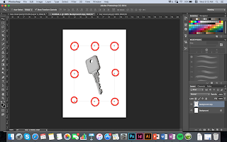
First of all, I created a new file and duplicate the drawing of the key to here. As the picture is too big, I have to change its size.

Move Tool
To change the size of the picture, I used the Move tool and selected "show transform controls". In order to change its height and width in the same percentage, I clicked the little boxes which showed the transform controls. Then I changed the size by adjusting the percentage of height and width on the top.


Choose "Show transform controls"

The "little boxes" I have mentioned


Adjust the percentage of height and width to the size you want, then apply it.
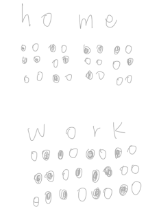
Before I started to draw the key cover design, I searched my old post to find the braille language of "home" and "work" first.

P.S. Old post - Research for Individual Project

I draw it in a new file in Photoshop for reference.
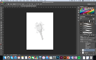
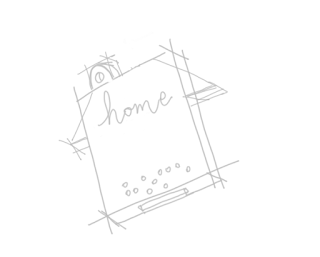
Then I created two more layers, "Graph" and "Key cover". I started drawing the outline of the key cover based on the layer "key", so I would know how big do the key cover should be.


I hid the layer "key" and focused on drawing the graph of key cover.


I created a new layer called "Home" for the braille I am going to draw, I will merge them together once it is done.


Graph of key cover with a key
Graph of key cover

After asking for comments on my design, I want to adjust the size of the hole on the top. My classmate said the key on the top might be too small for the visually impaired people, as they might find it is hard to link all the keys together with that tiny hole. I think it is important to ask for different opinions because sometimes I may neglect some details and I can improve my work by asking more feedbacks. I would improve my design now and hopefully, I can update my process within tonight.

Logo Design

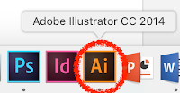
I used Adobe Illustrator CC for designing my own logo. The logo will be used on my website and my products of the major project.

Adobe Illustrator CC

My general idea came from the first two letters of my name, Janis. People usually use the first letters of their name, I do not want to be so mainstream, so I choose "J" and "a". I started to think about what can I do with these two letters.


The font I picked.

Now, I am going to show the process I design and improve my logo:

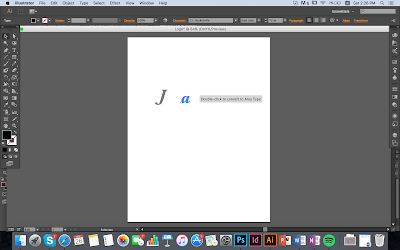
Firstly, I tried few different position for the letter "a", such as put it upside down.

I reversed the letter "a" and a small part of it overlapped on "J".

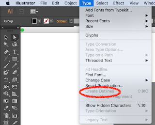
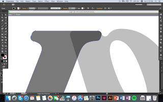
As I want to make the angles smooth, I had to create the outline of the font so I can adjust the outline.

Click "Type", then select "Create outline".

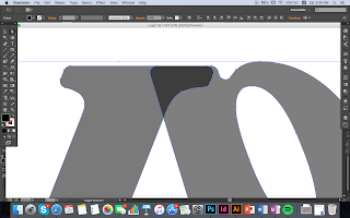
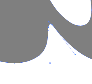
You can see there are some dots on the edge.

I adjusted it to be smooth and round.

However, it created an outline of two letters, I wanted to adjust the position of the letter "J" only. Then, I found out I can double click on "J". The unselected object would be lighter in colour, so I can be more concentrated on the letter "J".

after adjustment.

I adjust some small details by moving the dots with a line. Double click the dots, it will show a line with two dots on two ends.

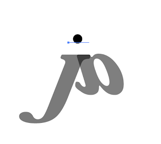
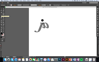
Then, I added a circle.

The final design before changing colours.

I have spent more than 2 hours on designing and adjusting the logo. I think the main reason I spent so much time on it is I had to do many tests to see what angle and size look better. Then, I put different colour to see which one is the best for the logo.


The reason I did not choose this one is it is the green colour does not fit with the blue-black colour. Overall it looks so dull and not attractive.


Afterwards, I choose the blue colour tone, so they must match with each other. However, this time it is too dark in colour, it looks boring.

The final piece

Lastly, I used blue-grey for "J" and light blue for "a". It looks young and energetic. It is not the perfect logo for me, so I might improve it in the future. 

I put it on the top of my website.

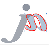
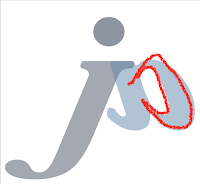
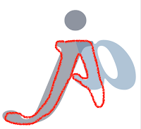
Now I am going to explain my design. It might be only two letters "j" and "a" in my design, actually you can see my name Janis in these two letters.

 
"j"


"A"

"n"
"i"

"s" in calligraphy alphabet

I have watched a video called "[ AI ] adobe illustrator毛筆手寫字製作大法" on Youtube 2 months ago as I wanted to design a logo for my friend. The Youtuber speaks in Cantonese, so it might not be available to everyone, but it is quite useful for starters. You do not have to listen to him at all, you can look at what he did in first few minutes. I think the most useful and helpful part is the first few minutes.

After all, I am so happy that I have my own logo now. However, I might want to draw it with digital drawing tablet later and modify the colour. At this moment, I like this logo and I would like to use it for my products of the major project and my website. It is the second time for me to use Adobe Illustrator, and I only know some basic skills of it. I have to do more practices and explore further more in the coming days.

Final Show: In-class Activity (Watercolour)

I told Tom about the idea I have been explaining in last post, he encouraged me to present it to the whole team. They like my idea, and we ...